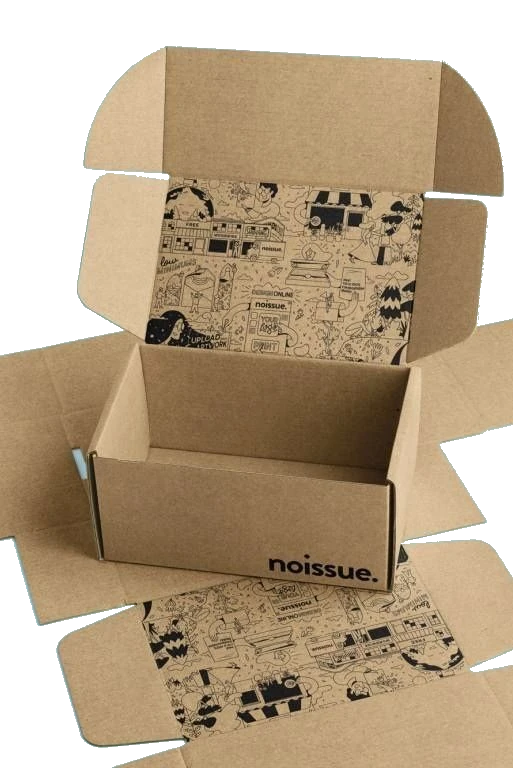
Almost every folding carton decision comes down to two families of paperboard: natural kraft and bleached SBS. Everything else — thickness, coating, finish — is a variation on top of that first choice.
They are not interchangeable. They print differently, they photograph differently, they cost differently, and they say different things about your brand before a customer has read a single word. Here is how to choose deliberately instead of by default.
Key takeaways
- Kraft is unbleached and brown; SBS is bleached and bright white on the print side.
- Kraft signals natural, recycled, and artisanal. SBS signals clean, precise, and premium retail.
- SBS reproduces photography and pale colours accurately; kraft shifts everything warm and dark.
- Neither is universally cheaper — the gap depends on thickness, coating, and run size.
- Thickness is specified in points (pt) or GSM; 14pt–18pt covers most retail cartons.
What kraft board actually is
Kraft board is paperboard left unbleached after pulping, which is why it keeps its natural brown colour and visible fibre texture. Because it skips the bleaching stage, it retains more fibre strength and carries an obvious recycled, unprocessed character.
It is uncoated or lightly coated on the print side, so it absorbs ink rather than holding it on the surface. That absorption is exactly what gives kraft its soft, slightly faded print look — and exactly why it is the wrong choice for bright, photographic artwork.
- Natural brown surface with visible fibre
- Strong, tactile, and reads as sustainable
- Ink sinks in — colours print warmer and softer
- No white ink in a standard CMYK run, so highlights come from bare board
What SBS board actually is
SBS stands for solid bleached sulphate — paperboard made from bleached virgin pulp, giving a bright white surface on both sides. Most SBS used for retail packaging is clay-coated on the print side (often labelled C1S, coated one side, or C2S, coated two sides).
That coating keeps ink on the surface instead of letting it soak in. The result is high contrast, accurate colour, sharp small type, and a smooth base for foil, spot UV, and lamination.
- Bright white surface, smooth coated print side
- Accurate CMYK and Pantone reproduction
- Best base for foil stamping, spot UV, and soft-touch lamination
- Reads clean, precise, and retail-premium
Side by side
The practical differences show up in four places: how it looks, how it prints, how it feels, and what it signals.
| Kraft | SBS | |
|---|---|---|
| Surface colour | Natural brown | Bright white |
| Coating | Uncoated or lightly coated | Usually clay-coated one or both sides |
| Colour accuracy | Shifts warm and darker | Accurate and high contrast |
| Photography | Poor — muddy and low contrast | Excellent |
| Best finishes | Blind emboss, single-colour print | Foil, spot UV, lamination |
| Brand signal | Natural, recycled, artisanal | Clean, precise, premium retail |
How each one prints
This is where most surprises happen. On SBS, what you approve on a calibrated proof is close to what arrives. On kraft, every colour is filtered through brown.
Pale tones are the clearest example. A soft mint green on SBS stays mint. The same file on kraft comes back olive. Pure white simply does not exist on kraft in a standard run, because the lightest value available is the board itself.
The cost question, honestly
Kraft is often assumed to be the budget option because it looks unfinished. That is not reliably true. Pricing depends on board thickness, coating, availability, run size, and how many print passes your design needs — not on colour alone.
What does move cost predictably is complexity. A one-colour design on uncoated kraft is genuinely cheap to produce. Four-colour photography plus foil plus lamination costs more regardless of which board sits underneath it.
Getting thickness right
Board thickness is quoted in points (thousandths of an inch) or GSM (grams per square metre). Too thin and the carton feels flimsy and dents in transit; too thick and it becomes difficult to fold cleanly and costs more to ship.
| Thickness | Typical use |
|---|---|
| 12pt | Lightweight cartons for small, light products |
| 14pt–16pt | The everyday range for most retail folding cartons |
| 18pt–24pt | Heavier products, larger panels, or a more substantial feel |
How to choose in practice
Work backwards from what has to be true on the shelf or in the photograph.
- Choose SBS if your design uses photography, pale colours, fine type, foil, or spot UV.
- Choose kraft if your positioning is natural, refill, artisanal, or eco-led and your palette is earthy.
- Choose white-topped kraft if you want a natural interior with an accurate printed exterior.
- If the product is food, confirm the specific board and coating are approved for your contact type before ordering.
Ask for both, then decide
This decision is genuinely hard to make on a screen and genuinely easy to make with two samples on a desk. Colour behaviour, surface texture, and perceived quality are physical properties.
We will send printed samples on both stocks with your artwork before you commit to a run. Hold them next to your product, photograph both, and the answer usually becomes obvious within a minute.
Frequently asked questions
Not automatically. Pricing depends on thickness, coating, run size, and the number of print and finishing passes rather than board colour alone. A one-colour design on uncoated kraft is genuinely inexpensive, but complex artwork costs similar amounts on either stock.
Want this reviewed on your own project?
Send us your product details and our team will recommend a construction and stock, supply a free dieline and 3D mockup, and price two or three options — within 24 hours.